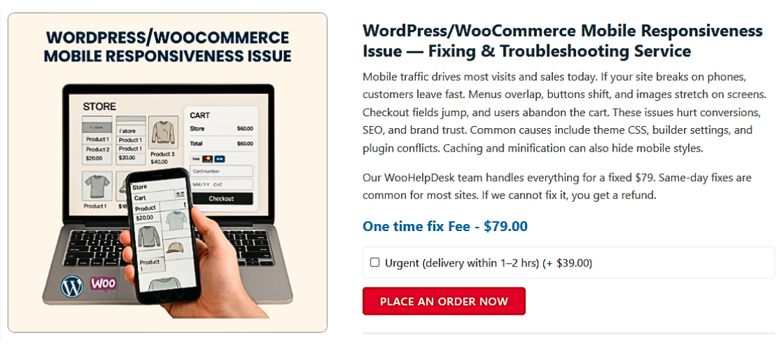
WooCommerce Shop Page Not Responsive on Mobile? Here’s How to Fix It
Table of Contents
- Introduction & Importance of Mobile Responsiveness
- Symptoms & Common Mobile Display Issues in WooCommerce
- Root Causes of Mobile Layout Problems in WooCommerce
- How to Fix WooCommerce Shop Page Not Responsive on Mobile Issue
- Best Practices for a Mobile-Friendly Shop Page
- Tools to Help with Mobile Optimization
- Conclusion
Introduction & Importance of Mobile Responsiveness
WooCommerce is one of the most used eCommerce platforms on WordPress. It helps store owners sell products easily through their websites. But many users face mobile layout issues, especially on the shop page. These issues affect how customers view and use the store on phones.
Today, more than half of online shoppers use mobile devices. In the U.S., this number continues to grow each year. If your WooCommerce shop page is not responsive on mobile, you’re losing sales. A broken mobile layout pushes users away and hurts your brand image.
Mobile responsiveness means your site fits well on all screen sizes. It should look good and work smoothly on smartphones and tablets. This is not just about looks. It affects user experience, SEO rankings, and sales.
When your shop page breaks on mobile, users can’t browse products easily. Buttons may be hard to click. Product images may not load properly. In some cases, the whole layout appears messy or misaligned.
Why should you care about mobile optimization?
- Google uses mobile-first indexing for search rankings.
- Most online shoppers are on phones or tablets.
- A poor mobile design leads to high bounce rates.
- Unresponsive pages damage trust and drive customers away.
If your WooCommerce shop page is not mobile-friendly, it’s time to fix it. The rest of this post will help you solve this issue step by step. You’ll learn how to identify the problem, find the cause, and apply the right fix — even without technical skills.
Symptoms & Common Mobile Display Issues in WooCommerce
A broken WooCommerce shop page on mobile doesn’t go unnoticed. You’ll often see clear signs that something is wrong. These layout issues create a bad shopping experience and turn users away. Let’s break down the most common symptoms.
Symptoms of Poor Mobile Display
You might notice problems as soon as you open the shop page on your phone. These are the most frequent layout issues store owners face:
- Product grid is misaligned or overlapping.
- Images appear cut off or stretched.
- Text overlaps with buttons or other content.
- Filters or sidebars push product listings too far down.
- Add to cart buttons are hard to tap.
- Scroll or swipe functions do not work properly.
Sometimes, the menu also breaks or doesn’t respond. Mobile users may find it hard to browse categories. This creates confusion and frustration. If users can’t find what they need quickly, they will leave.
User Feedback Indicators
You don’t always need tools to spot mobile issues. Sometimes your customers will tell you first. Pay attention to these signs:
- Higher bounce rate from mobile traffic in Google Analytics.
- Lower sales or conversions from mobile users.
- Customers complain about mobile navigation or design.
- Reviews mention trouble using the shop page on phones.
These are real-world signals that something needs fixing. You may not see the issue on your desktop. But if mobile shoppers can’t use your site, it impacts your success.
Recognizing these symptoms is the first step. If you’ve seen one or more of these signs, your WooCommerce shop page likely has mobile responsiveness issues.
Root Causes of Mobile Layout Problems in WooCommerce
Knowing the reason behind your mobile layout issues is half the solution. Several common factors can cause your WooCommerce shop page to look broken on phones. Let’s walk through the main ones, so you can identify what’s affecting your store.
Theme-Related Issues
Your WordPress theme controls how your site looks. If your theme isn’t designed for mobile devices, it can cause layout problems.
Common theme-related issues include:
- The theme is outdated or no longer supported.
- It doesn’t include responsive design settings.
- It conflicts with the latest version of WooCommerce.
If your theme doesn’t adjust content for smaller screens, things break easily.
Page Builder Conflicts
Many store owners use page builders like Elementor or WPBakery. These tools give you control over layout. But they can cause mobile display problems if not used correctly.
Examples of conflicts:
- Columns do not stack properly on small screens.
- Padding and margins look fine on desktop but break on mobile.
- Builder settings override WooCommerce styles.
Always check your layout in mobile view inside the page builder.
Plugin Conflicts
Some plugins change the way your shop page behaves. These changes may not be mobile-friendly.
Problematic plugin types include:
- Product filter or sorting tools
- Infinite scroll plugins
- Add-on or extra feature plugins
- Popup or banner plugins
One broken plugin can ruin your mobile layout. Test by disabling plugins one by one.
Custom CSS or JavaScript Errors
If you or a developer added custom CSS or JavaScript, it may be the cause.
Common mistakes include:
- CSS without media queries for mobile devices
- Fixed widths or heights that don’t scale on phones
- JavaScript that doesn’t adjust to screen size
These errors are often hidden but easy to fix with a little cleanup.
Image or Grid Settings
Sometimes, image settings in WooCommerce are not optimized for mobile. Too many product columns or oversized thumbnails can distort your layout.
Watch for:
- Grids with 4+ columns on small screens
- Thumbnail images that do not resize correctly
- Layouts not adapting to screen width
Viewport Meta Tag Issues
Your theme’s header should include the correct viewport meta tag. If it’s missing or incorrect, your shop page won’t scale to mobile screens.
Correct tag:
If this is not in place, the site will look zoomed out or tiny.
How to Fix WooCommerce Shop Page Not Responsive on Mobile Issue
Once you understand the problem, fixing your WooCommerce shop page becomes easier. Most mobile layout issues can be solved without deep technical knowledge. Follow these steps to improve the mobile design of your shop page.
- Use a Mobile-Optimized Theme
Your theme is the foundation of your site’s design. If it’s not responsive, mobile problems will follow.
To fix theme-related issues:
- Use a responsive and WooCommerce-friendly theme.
- Recommended free themes: Storefront, Astra, Blocksy, or OceanWP.
- Test your new theme in mobile view before activating it.
- Always back up your site before switching themes.
These themes offer built-in mobile support and are updated regularly.
- Update Everything
Outdated plugins, themes, or WordPress core can break layouts on mobile.
Here’s what to do:
- Go to Dashboard > Updates.
- Update WordPress core, your theme, and all plugins.
- Update WooCommerce to the latest stable version.
After updates, clear your browser cache and refresh the shop page on mobile.
- Check for Plugin Conflicts
A plugin might be breaking your layout, even if it seems unrelated.


How to troubleshoot:
- Deactivate all non-essential plugins.
- Check your shop page on mobile after each deactivation.
- Use the Health Check & Troubleshooting plugin to test safely.
If the layout looks fine after disabling a plugin, that plugin is the cause.
- Fix Layout with Responsive CSS
Sometimes, a few lines of CSS can fix layout issues fast.
Example: Adjust product columns on mobile:
@media screen and (max-width: 768px) {
.woocommerce ul.products {
display: grid !important;
grid-template-columns: 1fr 1fr !important;
gap: 10px;
}
.woocommerce ul.products li.product {
width: 100% !important;
}
}
You can paste this into Appearance > Customize > Additional CSS. Always test changes on different screen sizes.
- Ensure Viewport Meta Tag is Present
This small code tells browsers to scale your site for mobile devices.
Add this tag to your theme’s header.php file:
If it’s missing or incorrect, your shop page will look zoomed out or broken.
- Customize Responsiveness in Page Builders
If you’re using Elementor, WPBakery, or other builders, use their mobile tools.
What to check:
- Open each section in responsive mode.
- Adjust padding, margins, and column widths for mobile.
- Use Elementor’s Device Preview to test changes.
- Set different styles for mobile, tablet, and desktop.
Don’t rely on desktop settings alone. Always review your mobile view.
- Optimize Image Sizes & Shop Columns
Large images and too many columns break the design on small screens.
To fix this:
- Go to WooCommerce > Settings > Products > Display.
- Set thumbnails to 300px or smaller.
- Use 1 or 2 columns for product grids on mobile.
- Avoid 3+ columns, which look too tight on phones.
Resize images if needed, and use compression plugins like Smush.
- Clear Cache & CDN
Sometimes changes don’t show up because of cached content.
Steps to clear cache:
- If using a caching plugin (like WP Rocket), clear the cache.
- If using Cloudflare or another CDN, purge the cache there too.
- Then test your site on a phone again.
Caching helps speed but can hide recent design changes.
- Test Across Devices
Never assume your site works just because it looks okay on one phone.
Test your WooCommerce shop page using:
- Chrome DevTools (inspect and switch to mobile view)
- Responsively App (test multiple devices side-by-side)
- Google’s Mobile-Friendly Test
- Real phones and tablets if possible
Testing ensures your layout works across all screen sizes and brands.
- When to Ask a Developer
If none of these steps help, it may be time for expert support.
When to reach out:
- You see code errors or broken layouts after updates.
- Plugins or theme files were edited manually.
- You rely on advanced features like AJAX filtering or custom add-ons.
You can contact a WooCommerce expert or reach out to WooHelpDesk.com for support.
Best Practices for a Mobile-Friendly Shop Page
A clean and simple mobile design keeps users engaged. Try to keep things light, fast, and easy to use.
Fixing your shop page once is great, but keeping it optimized is better. Following some best practices will help prevent future layout issues. It will also improve user experience and boost your store’s performance.
Here are some helpful best practices:
- Use a mobile-first design approach during development.
- Keep the product layout clean with 1–2 columns on phones.
- Avoid sidebars or unnecessary widgets on mobile screens.
- Make sure buttons are large enough to tap with one finger.
- Use short product names and clear pricing.
- Test your site after every update or plugin install.
Following these habits will reduce layout problems in the future.
Tools to Help with Mobile Optimization
Several free tools can help you spot and fix display issues. You don’t need to be a developer to use them.
Useful tools include:
- Google Mobile-Friendly Test – Check if your shop page passes mobile standards.
- Chrome DevTools – Preview and test your site in mobile view.
- PageSpeed Insights – See what’s slowing down your mobile layout.
- YellowPencil – Visually adjust CSS without writing code.
- Responsively App – Test how your shop page looks on different devices.
- WP Health Check – Detect conflicts between plugins and themes.
These tools make it easier to identify problems before your users do.
Conclusion
Your WooCommerce shop page needs to look and work great on mobile. A broken layout costs you sales and weakens trust. With the right steps, you can fix most mobile issues yourself.
Don’t wait until customers start complaining. Test and improve your mobile layout regularly.
If you’re still stuck, or want expert help, reach out to WooHelpDesk.com. Our team can help you fix, clean, and improve your shop’s mobile experience — fast and stress-free.