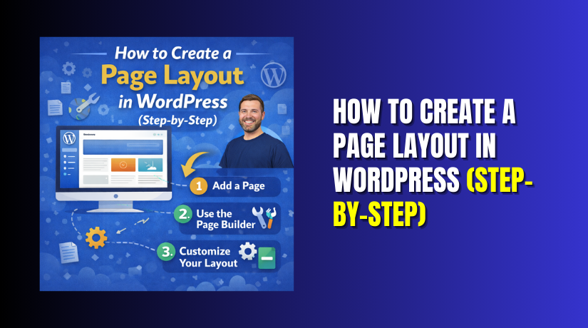
How to Create a Page Layout in WordPress (Step-by-Step)
Table of Contents
- Introduction
- Quick checklist before you start
- Method 1: Build a clean layout using the Block Editor
- Method 2: Create layouts using the Site Editor (for block themes)
- Method 3: Use a page builder plugin (when you need drag-and-drop speed)
- How to update or change an existing page layout safely
- Common layout problems and quick fixes
- Final layout checklist for a clean, SEO-friendly page
- Conclusion
Introduction
A page layout is the structure of a page. It controls how content is placed, spaced, and grouped. A good layout helps users read faster and take action. It also keeps your page clean on mobile screens.
In this guide, you will learn how to create a page layout in WordPress step by step. You will build a simple layout with sections like a hero area, key benefits, and a call-to-action. You do not need coding skills for this process. WordPress already gives you strong tools for layout work.
The Block Editor can work like a WordPress page layout builder. You can add blocks, align sections, and control spacing. You can also create a WordPress custom page layout that matches your brand style. Later, when you need how to change page layout in WordPress, the same steps will help you update sections safely.
This guide is written for beginners and busy site owners. It is also useful for store owners and service businesses. If you follow the steps in order, you can create page layout WordPress users will find easy to read and use.
Quick checklist before you start
Before you start building your layout, prepare a few things. This saves time and avoids confusion later.
- Decide the page goal. Example: service page or landing page.
- Write one clear headline that explains the offer.
- Prepare a short intro paragraph and one main call-to-action.
- Pick one to three images that match your topic.
- Keep your main links ready. Example: contact or pricing page.
- Make sure you can preview on mobile and desktop screens.
This small setup helps your layout look consistent. It also helps you use WordPress layout settings in a smarter way.
Method 1: Build a clean layout using the Block Editor
Step 1: Create a new page and open the editor
Go to your WordPress dashboard and click Pages → Add New. Add a clear page title based on your goal. Then click the Settings icon on the top right. This opens the sidebar where you control page and block options.
Now click the + icon to add your first block. You can start with a Heading block for your first section. Keep the first draft simple. Save the page as a Draft so you can edit safely. You can also open List View to see your block structure clearly. This makes editing easier when your page grows.
Step 2: Set the page structure before adding content
Do not start by writing everything at once. First, create your page structure with sections. Use a Group block for each section. This keeps your blocks organized and easier to style.
A simple page layout usually includes these core sections:
- Hero section with headline, short text, and a button
- Benefits section with two or three key points
- Proof section with reviews, logos, or results
- Final call-to-action section with one clear next step
Add each section as a Group block first. Then place a Heading inside each group. Use temporary text like “Hero Section” or “Benefits Section.” This gives you a clear structure before you add final content. It also helps you keep spacing and alignment under control while building.
Step 3: Build a simple “Hero section” that looks modern
Your hero section is the first part users see. It should explain the page fast. Keep it clean and focused. Avoid too many messages at once.
Start by clicking inside your first Group section. Now add one of these options:
- Cover block for an image background and text overlay.
- Group block with an Image block and text beside it.
For most sites, a Group block layout looks cleaner. It also loads faster. Add these blocks inside the hero section in this order.
- Heading block for your main headline.
- Paragraph block for one short support line.
- Buttons block for one main call-to-action.
- Optional Image block for a clean visual.
Keep your headline clear and benefit focused. Use short words and direct meaning. Your support line should explain who it helps. Your button should say the next step clearly.
Good button examples for USA users include:
- Get a Quote
- Book a Call
- View Pricing
- Contact Us Today
Now open the right sidebar and adjust the layout controls. Here you use WordPress layout settings like alignment and spacing. Keep padding balanced so the hero looks even. Use “Wide width” only if it looks better.
If you are trying to create page layout WordPress readers trust, keep design simple. Too many colors reduce clarity. Stick to one button style across the page.
Step 4: Add a two or three-column section without breaking mobile
Columns help you show multiple points in a clean way. They work well for features, services, or steps. But columns can look bad on phones if done wrong.
Click inside your Benefits section Group block. Add a Columns block. Choose two columns for most pages. Three columns can work, but only with short text.
Inside each column, add this structure:
- Small heading for the point title
- One short paragraph with a clear benefit
- Optional image or icon at the top
Keep each column text close in length. Uneven columns look messy. Also keep headings short so they wrap well.
To keep the layout mobile safe, follow these rules:
- Use two columns for long text sections.
- Keep each paragraph under three short lines.
- Avoid large images inside columns.
- Do not add too many buttons inside columns.
You can also use a Group block inside each column. This helps spacing stay consistent. It also makes it easier to copy and reuse later.
This is where many users fail when they create page layout WordPress pages. They add too much content inside columns. Then mobile layout becomes hard to read.
Step 5: Add trust and conversion sections that support your goal
A good layout is not only about design. It is also about action. Trust sections help users feel safe. Conversion sections guide them to click.
Add a proof section
Open your Proof section Group block. Add one of these proof types:
- Testimonials from real clients
- Short results with numbers and outcomes
- Logos of tools, partners, or clients
- Simple before and after points
For testimonials, use three short blocks:
- Short review text
- Name or business type
- Optional location or service used
Keep review text short and easy to scan. Avoid long story style reviews. Add two or three testimonials for best balance.
Add a clear call-to-action section
Now create a CTA section near the bottom. This section should repeat your main action. Add a short heading, one support line, and a button.
A strong CTA section layout can include:
- A heading that repeats the main benefit
- One sentence that removes doubt
- One button that matches your hero button
- Optional contact details for quick trust
If you plan to use a builder later, keep this structure in mind. A WordPress page layout builder will follow the same logic. It still needs clear sections and spacing.
When you build these trust sections, you also create stronger structure. That becomes your WordPress custom page layout for service pages. It works well for SEO and user flow.
If you later need how to change page layout in WordPress, these sections are easy to adjust. You can swap text, move blocks, or change spacing. Your structure stays stable and clean.
Step 6: Control width, spacing, and alignment the right way
A layout looks “professional” when spacing stays consistent. Most pages look messy because spacing changes section to section. Fix this early so your page stays clean on mobile too.
Start by clicking your main section Group block. Open the right sidebar settings. Now focus on these WordPress layout settings:
- Alignment (Normal, Wide, Full width)
- Padding (space inside a section)
- Block spacing (space between blocks)
- Margin (space outside a block)
Keep widths consistent across the page
Use “Normal” width for most text sections. This improves reading comfort. Use “Wide” only for hero backgrounds or full banners. Avoid mixing widths in every section. That creates an uneven visual flow.
If your theme supports it, keep the same container width everywhere. This helps when you create page layout WordPress users can follow easily.
Use padding instead of too many spacer blocks
Spacer blocks can help, but overuse causes layout breaks. Instead, add padding inside Group sections. Padding gives cleaner spacing and better control.
Use simple spacing rules like these:
- Small padding for short sections
- Medium padding for hero and CTA sections
- Same top and bottom padding for most sections
Align content with a clear pattern
Keep headings left aligned for most business pages. Center alignment can work for the hero and final CTA. Do not center everything on the page. It reduces readability and slows scanning.
Also keep heading sizes consistent:
- One H1 on the page only
- Use H2 for main sections
- Use H3 for small section headings
This improves structure and makes editing easier later.
Step 7: Save time with Patterns and reusable sections
WordPress patterns help you build fast layouts with clean design. They are pre-made block sections you can insert and edit. This is useful if you need a quick WordPress page layout builder style workflow.
How to insert a pattern
Click the + icon and switch to the Patterns tab. Choose a layout that matches your section goal. Add it to the page and replace the text and images.
Patterns work well for:
- Hero sections with buttons
- Feature sections with columns
- Testimonials and social proof blocks
- CTA sections with a clean button
After inserting, adjust spacing so it matches your page style. Keep padding consistent with other sections. This helps your WordPress custom page layout look unified.
How to create reusable sections for future pages
When you build a great section, you can reuse it. This keeps your design consistent across the site. It also saves time for service pages and landing pages.
To do this, follow these steps:
- Select the full Group block section.
- Click the three-dot menu in the block toolbar.
- Choose “Create pattern” or “Synced pattern” (if available).
- Name it clearly, like “Service CTA Section.”
A synced pattern updates everywhere when you edit it once. A normal pattern is a copy that you can change per page. Choose based on your need.
This is a smart way to create page layout WordPress pages faster later.
Step 8: Preview, test mobile, then publish
Before you publish, do a quick layout review. Many layout issues only show during preview. This step helps you catch spacing and mobile problems early.
Preview the page on all screen sizes
Click Preview and test these views:
- Desktop view for alignment and section width
- Tablet view for column stacking and spacing
- Mobile view for font size and button spacing
Check your columns on mobile carefully. If text becomes too tight, reduce content per column. You can also switch from three columns to two columns.
Use revisions and drafts for safe updates
WordPress saves revisions automatically on many setups. Still, it is smart to save a clean draft before publishing. If you are updating a live page, duplicate it first. This is helpful when learning how to change page layout in WordPress without risk.
For safe publishing, follow this simple checklist:
- Headings are in the right order and easy to scan
- Buttons work and go to the correct pages
- Images look clear and load fast
- Spacing is consistent across every section
- Mobile view looks clean and readable
When everything looks good, click Publish. Your page layout is now live. You can keep improving it over time using the same steps.
Method 2: Create layouts using the Site Editor (for block themes)
This method works only with block themes. You can confirm it fast. Go to Appearance in your WordPress dashboard. If you see Editor, you have a block theme. If you only see Customize, skip this method.
The Site Editor is useful for layout control. It helps you build page layouts that stay consistent. It also helps when your header or footer spacing looks wrong.
Step 1: Open the Site Editor and find templates
Go to Appearance → Editor and open it. You will see options like Templates and Template Parts. Templates control how pages display site-wide. Template Parts control shared parts like header and footer.


Now open Templates and look for page templates. Many themes provide options like Default, Full Width, and Blank. These templates affect the container width and layout structure. This is a core part of WordPress layout settings in block themes.
Step 2: Create or edit a page template for your layout
If your page needs a special structure, edit a template. You can also create a new one. Choose a base template and make changes carefully.
Here are common changes you can make:
- Remove the sidebar for cleaner reading space.
- Switch to full width for wide hero sections.
- Add spacing so content does not touch the edges.
- Control header height to avoid a crowded top area.
When you edit a template, it affects pages using it. That is why you should be careful here. If you want only one page to change, create a new template. Name it clearly like “Service Page Layout” or “Landing Layout.”
This approach helps you build a stable WordPress custom page layout. It also reduces repeated work across pages.
Step 3: Use Template Parts for consistent header and footer
Many layout issues come from header and footer spacing. In Site Editor, open Template Parts. Select Header or Footer and review the structure.
Fix common header and footer layout issues like these:
- Too much padding above the logo.
- Menu wrapping on smaller screens.
- Buttons in the header looking misaligned.
- Footer columns stacking in an odd order.
After fixing these parts, your page layouts look cleaner. This helps when you create page layout WordPress pages for service and sales.
Step 4: Set global styles for a consistent look
In Site Editor, open the Styles panel. This is where you control global fonts, buttons, and spacing rules. These settings affect all pages using the theme.
Focus on these style areas first:
- Headings font size and weight
- Paragraph line height for easy reading
- Button color, border, and padding
- Link styles for clear visibility
Global styles help you avoid block-by-block fixes. They also keep the site consistent. If you later need how to change page layout in WordPress, this will save time.
Step 5: Assign the template to your page
Now go back to the page you created. Open the page editor and check the Page settings sidebar. Look for Template and choose your new template. Preview and test the page. Make sure width and spacing look correct. Then save changes.
This Site Editor method is best for consistent site layouts. It is also best when themes limit layout control in pages.
Method 3: Use a page builder plugin (when you need drag-and-drop speed)
Sometimes the Block Editor is not enough for your design needs. A builder can help you move faster. Builders are useful for landing pages and modern design sections. They also help non-technical users build strong layouts quickly.
A builder works like a full WordPress page layout builder tool. It gives more drag-and-drop control than default blocks. But you should still use it carefully for speed.
Step 1: Install and activate a page builder plugin
Go to Plugins → Add New in your dashboard. Search for a builder you trust and install it. Activate it and follow the setup steps. Many builders add a button in the page editor.
Step 2: Create a page and open the builder editor
Create a new page like you did before. Then click the builder button. Example: “Edit with Builder.” You will see a new editing screen with sections and widgets.
Most builders follow the same layout flow:
- Add a main section for the hero
- Add columns for features and benefits
- Add a proof section with testimonials
- Add a CTA section near the bottom
This still follows the same layout logic. The tool is different, but structure stays the same.
Step 3: Choose a template and customize it
Builders often provide ready page templates. Choose a clean template that matches your goal. Replace the text and images with your own content.
When customizing, follow these rules for a better layout:
- Keep only one main button style on the page.
- Use consistent spacing between every section.
- Avoid heavy animations and too many moving parts.
- Keep headings short so they look good on mobile.
This is how you create page layout WordPress pages that convert better.
Step 4: Keep performance in mind while using builders
Builders can add extra code and slow down pages. That can hurt user experience and SEO. Use only the widgets you actually need. Avoid adding large videos as backgrounds. Compress images before uploading them.
If you want a clean WordPress custom page layout, keep it simple. Better layout does not mean more effects. It means clearer sections and smooth reading flow.
Step 5: Save, preview, and publish like a normal page
After building your page, preview it on mobile and desktop. Check spacing, buttons, and text size. Then publish when everything looks right.
If later you need how to change page layout in WordPress, builders make it easy. You can drag sections, adjust padding, and update templates fast. Just remember to test mobile view every time.
How to update or change an existing page layout safely
Many site owners edit a live page and regret it. A small layout change can break spacing or mobile view. Use a safe method before you make big edits. This is the best way to learn how to change page layout in WordPress without risk.
Step 1: Duplicate the page before major edits
Create a copy of your page and edit the copy first. You can use a duplicate plugin or do it manually. Manual duplication is simple for most pages.
Use this safe approach:
- Copy the page content into a new draft page.
- Name it with “TEST” or “New Layout” at the end.
- Keep the original page published and untouched.
After the test page looks perfect, you can swap it live.
Step 2: Use revisions and drafts to avoid mistakes
WordPress stores revisions on many setups. Revisions let you restore older versions fast. Still, you should work in Draft mode when possible.
Good safety habits include:
- Save changes often while editing sections.
- Preview changes before you click Update or Publish.
- Avoid editing on phone screens if possible.
These habits make it easier to create page layout WordPress pages that stay stable.
Step 3: Change the page template if layout feels tight
Sometimes your layout looks cramped because of the template. The default template may add sidebars or narrow width. Check the Page settings sidebar and look for Template options.
Common template changes include:
- Default to Full Width for wide sections
- Remove sidebar for service and landing pages
- Use blank template for custom builder pages
Template changes can fix layout without extra work. They also reduce spacing issues in many themes.
Step 4: Replace sections one-by-one for clean results
Do not rebuild the whole page in one go. Replace one section at a time and test. Start with the hero section first. Then update benefits, proof, and CTA.
A safe order works best:
- Hero section and main button
- Benefits section with columns
- Proof section with reviews or stats
- Final CTA section and contact links
This keeps your WordPress custom page layout easy to control.
Common layout problems and quick fixes
Even good layouts can look wrong after publishing. Themes, caching, and mobile settings can change the final display. Use these quick fixes before you panic.
Problem 1: Full-width layout is not working
Some themes limit full width layouts. Sometimes the wrong template is selected. Check the template option in the page sidebar.
Try these quick fixes:
- Switch the page template to Full Width.
- Set the main section block to Wide alignment.
- Check if your theme supports wide blocks.
If you use a builder, check its page layout option too.
Problem 2: Too much space between sections
This usually happens from stacked padding and spacers. One section may have padding plus spacer blocks. That creates double space.
Fix it using this method:
- Remove extra spacer blocks between sections.
- Use Group block padding instead of spacers.
- Keep top and bottom spacing the same everywhere.
These steps improve WordPress layout settings across your page.
Problem 3: Columns look bad on mobile screens
Columns can stack in strange ways on small devices. Long headings and large images can break the layout. This is common when you try to create page layout WordPress pages fast.
Fix mobile columns like this:
- Use two columns instead of three.
- Keep each column text short and balanced.
- Reduce image size inside columns.
- Use smaller headings to avoid long wraps.
Always preview mobile view before you publish updates.
Problem 4: Fonts and buttons look inconsistent
This happens when some blocks use custom styles. Other blocks may use theme styles. The result looks mixed and unprofessional.
Fix it quickly:
- Reset block styles to default where possible.
- Use global styles if your theme supports them.
- Keep one button style for the whole page.
This helps your layout look clean and trustworthy.
Problem 5: Your page shows the old layout after updating
Caching can hide new changes for visitors. Your browser cache can do this too. Clear cache from your site and your browser.
Try these steps:
- Clear your plugin or hosting cache.
- Purge CDN cache if you use one.
- Hard refresh the page in your browser.
After that, check again in an incognito window.
Final layout checklist for a clean, SEO-friendly page
Before you call it done, do a final scan. This checklist helps your layout look better for USA users. It also improves clarity for search and readers.
- Use only one H1 heading on the whole page.
- Use clear H2 sections with short, helpful headings.
- Keep paragraphs short and easy to read.
- Add internal links to related posts and service pages.
- Compress images and add clear alt text.
- Make your main CTA easy to find and click.
- Test the full page on mobile and desktop views.
This checklist supports better structure and better results.
Conclusion
Now you know how to create a page layout in WordPress step by step. Start with a clear structure and build sections in order. Control spacing and test mobile view before publishing. Use patterns or templates to save time later. If your layout still looks wrong, support can help fast. For expert WordPress help, contact WooHelpDesk and get it fixed properly.